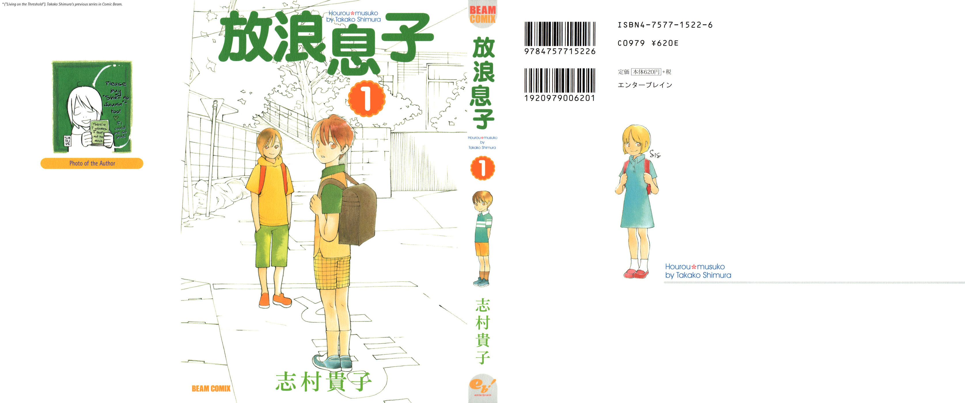
It’s time…. to review, analyze, think about, make fun of, gush over, and generally just look at everyone’s favorite Wandering Son by Takako Shimura.
I should preface this by stating that Takako Shimura is one of my all time favorite mangakas. In particular, I’m a massive fan of Happy Go Lucky Days, but I’ll save that for another day.
Anyways, more about Wandering Son. Arguably her most popular and well known work, it tends to garner very mixed reviews from trans people for a whole bunch of very valid reasons. I don’t give a fuck about talking about those reasons though since I’m sure you’ve heard the shpeel. Instead, I’m just gonna go chapter by chapter and talk about what I like, don’t like, and think is interesting. I’ll probably also do a few page/panel dissections for myself.
God I love her art.
God I love this.
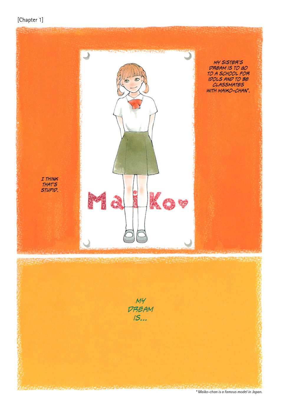
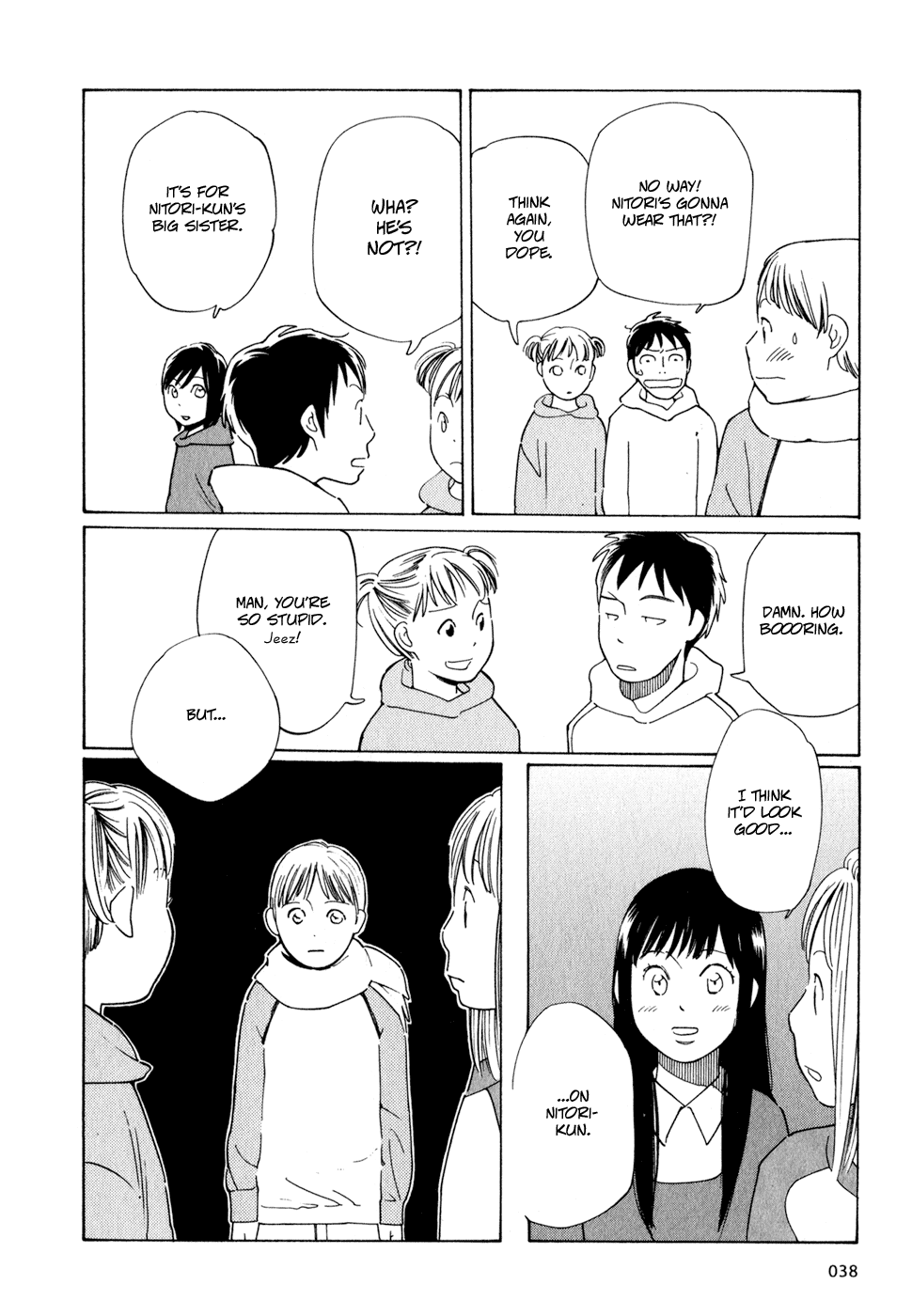
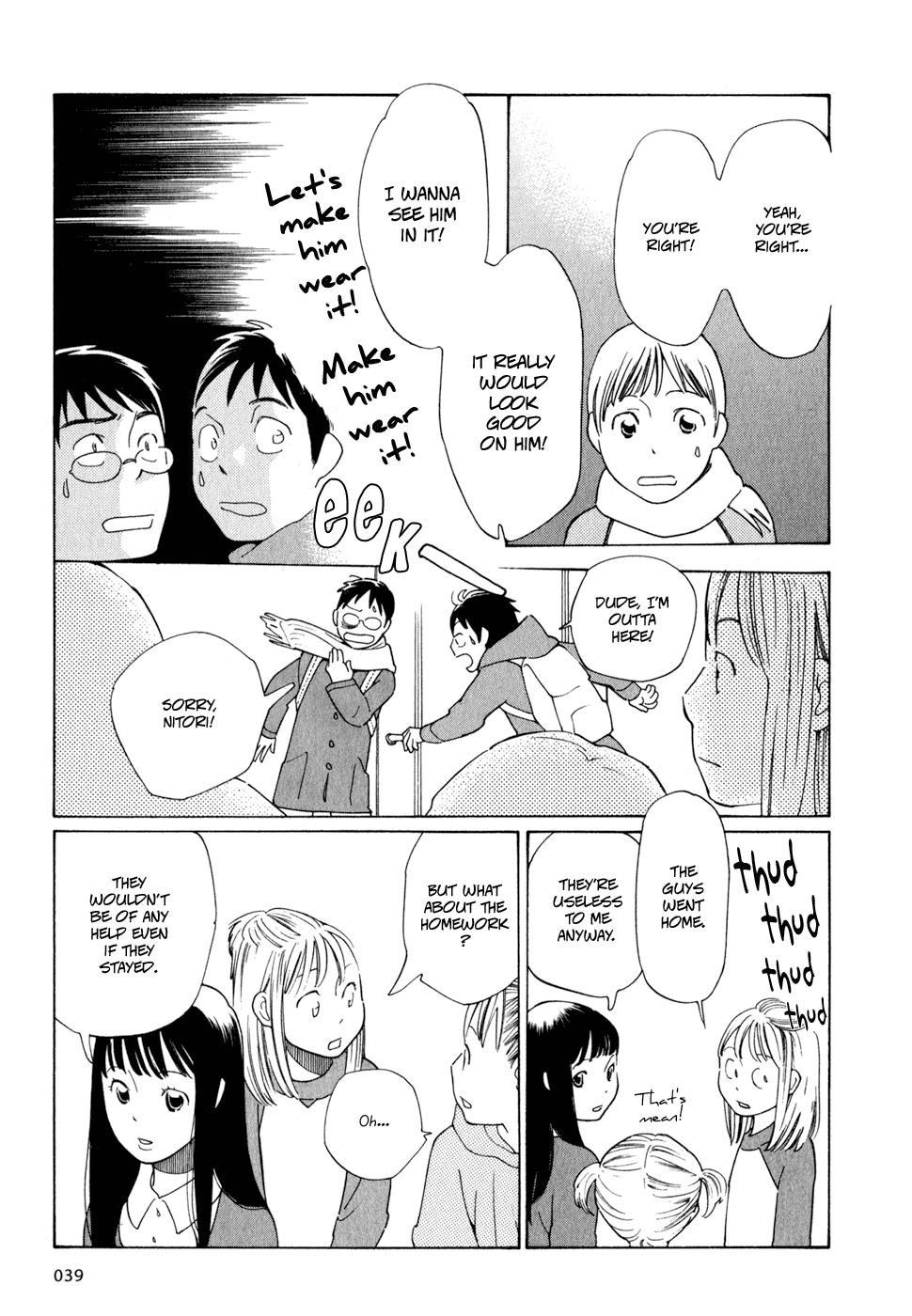
Chapter 1 opens with a really cute family exchange and then dives right into the fact that Nitori is extremely feminine to begin with and is often mistaken for a girl. It’s like, fine I guess, but very unsubtle for Shimura. Honestly, I’m not the biggest fan of the fact that only extremely feminine people are presented as being properly trans (which is to say Nitori and later Hiroyuki) and the others (Makoto and that one girl’s dad) are treated uh, not as well. It’s true to a degree that you get treated better the more you pass (and assimilate), though I doubt portraying that dynamic was part of the goal. I remember the first time I read Wandering Son I hadn’t really touched any other trans stories let alone comics so it totally blew my mind. I revisited it a year later and it was…. not as good. Anyways, totally forgot about this opening scene after my first read. Kinda boring! The whole dress thing is fine. It’s cute. I really like the little detail of Nitori asking for his own room. Just a really good way of suggesting his state of mind.
Chapter 2 opens with another really unsubtle dream scene. I think there’s a lot of scenes in this manga that, while somewhat accurate, bely the fact that Shimura likely only has the lives of adult trans women to base her story off of. Maybe I’m wrong, but my intuition and experience tells me that most elementary school boys wouldn’t conceptualize “wearing a wig” as part of being (or presenting as) a girl.
Now, there’s a point in Wandering Son that’s often framed as an inaccuracy that I wanna talk about for a sec. Basically the entire first section of the story revolves around a group of theatre inclined girls repeatedly dressing up Nitori. It’s pretty dumb, and probably not something that is based in a good understanding of trans lives. THAT BEING SAID, that’s actually exactly what my childhood was. Quiet nerd with long hair taken in by a friend group of half theatre nerds and half weirdos. This led to a lot of stuff, including getting my legs waxed on a kitchen counter, getting my makeup done reasonably often, crossdressing in public, etc.
I wanna talk about Shimura’s page layouts. I have a personal rule that it’s better to use simple, easy to read pages than to break yourself doing complicated page layouts unless you’re REALLY confident. You’ll notice that Shimura almost always split’s her pages into three horizontals, with each horizontal being split into anywhere between one to three verticals, generally landing on just two. It’s actually quite similar to Tillie Walden’s work, all the way down to how the characters are framed in the panels.
It’s a really really good system for making dense but readable pages that cover a lot of ground. I think comics as a media kind of struggle to convey a lot of information in a timely manner. A single page of a book can cover so much ground. We can’t always do the same. Three horizontals page layout is a middle ground between still readable and fully drawn while still covering a lot of ground. I also tend to default to three horizontals, and I think a lot of people do. You can find plenty of examples of four horizontal comics though; Skim comes to mind.
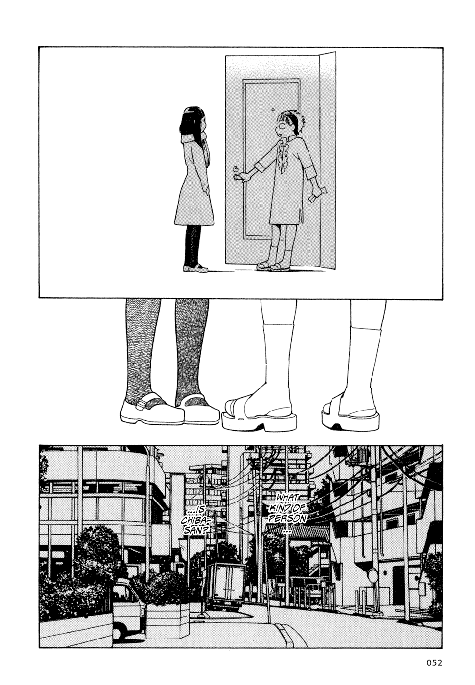
I love this page! It’s so cute. I love the cropping on the legs and I love Nitori’s little expression. Also shows how much mileage you can get out of the three horizontals.
Chapter 2 comes to a close with some more gender stuff. I think it’s better than the first chapter but still pretty average by Shimura’s standards. Chapter 3 isn’t particularly notable to me either. It introduces the first play, and establishes Chiba a little.
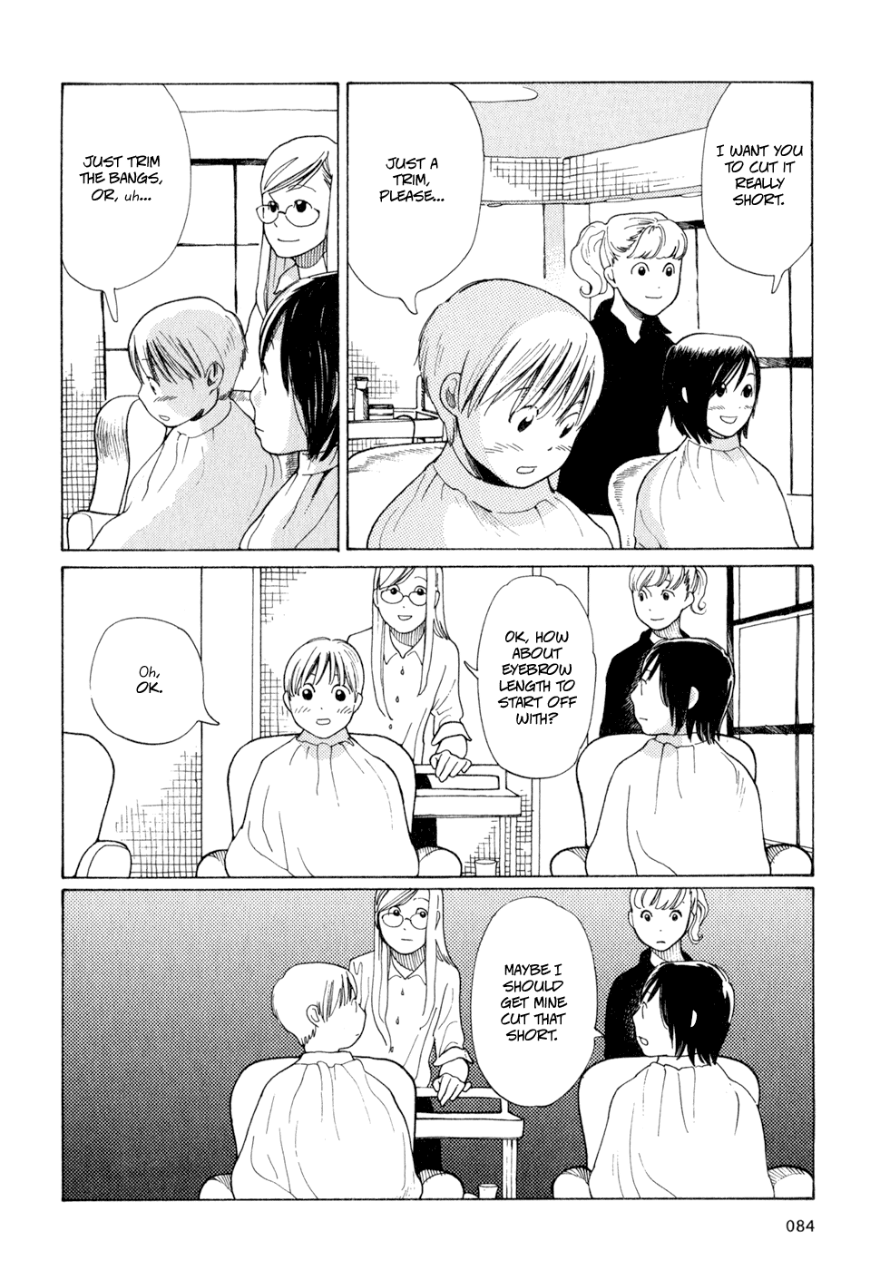

I really like these two pages from Chapter 4. Dense but readable, really pretty. Also hair cut stuff is just always great. Chapter 4 also introduces one of the most controversial parts of Wandering Son, Hiroyuki’s flirtations with Takatsuki. Yeah, obviously it’s a bit messy to have the only relevant adult trans woman hit on a middle school boy. Given the way it’s framed in the story, you get the sense that it isn’t supposed to be malicious which in a way makes it feel weirder? There’s this tonal dissonance between what’s happening and the way it’s framed. I think there’s a few ways you can interpret Hiroyuki’s interest in Shuu and Yoshino.
1: She has an inkling from the get go that Yoshino and Shuu are trans, and this is, in a twisted way, her attempt at playfully reaching out. It ends up being in poor taste though.
2: This whole sequence is somewhat of a naivety on Shimura’s part. It’s best to pay attention to the context and the framing than the raw content.
3: She’s a creep. (Boring! But fair!)
I will say, this might be one of my least favorite story beats throughout the whole comic. It culminates in that scene where Hiroyuki’s partner gropes Yoshino, which again. Not inherently a bad scene but the framing and tone is waaay off given the circumstances.
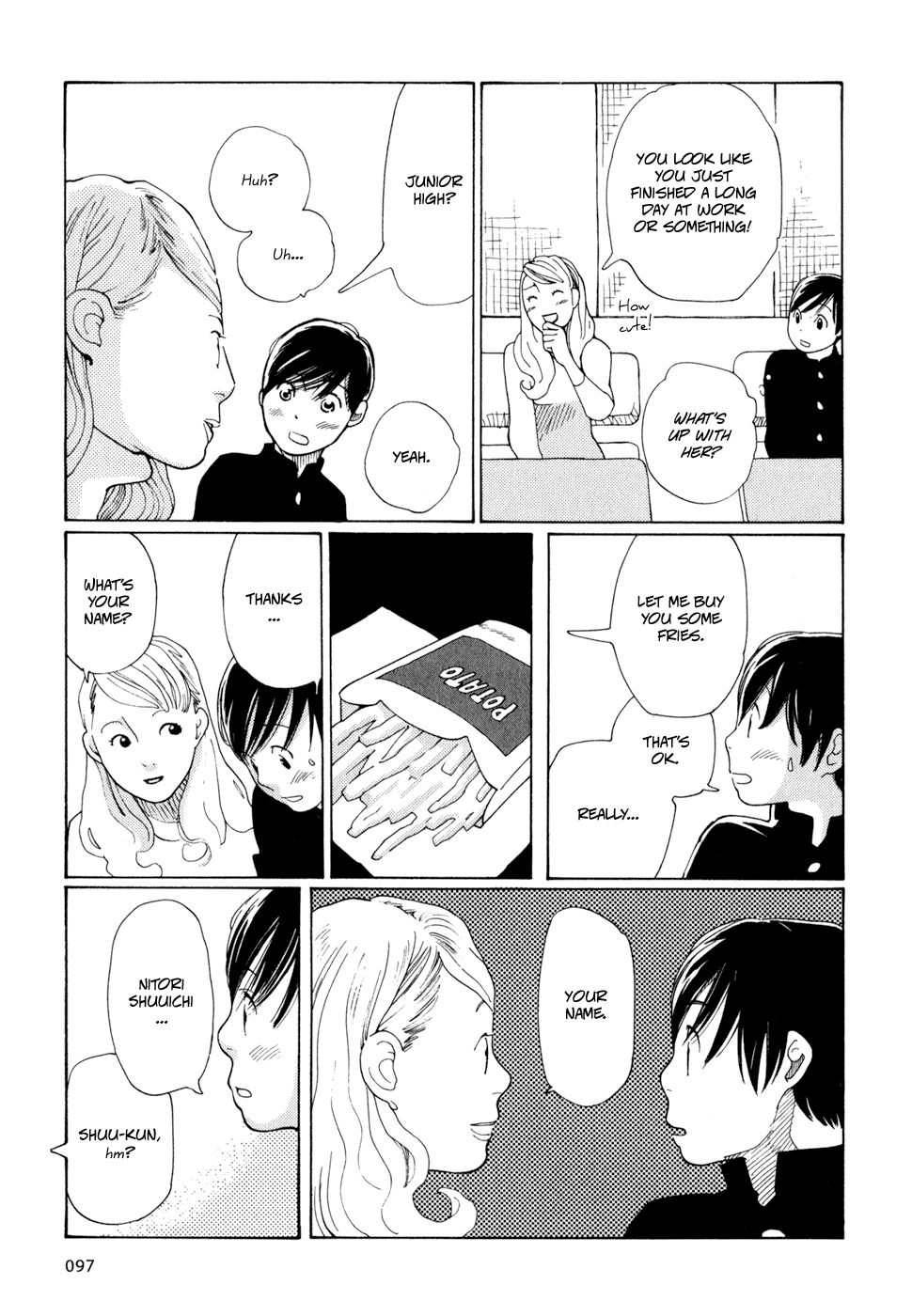
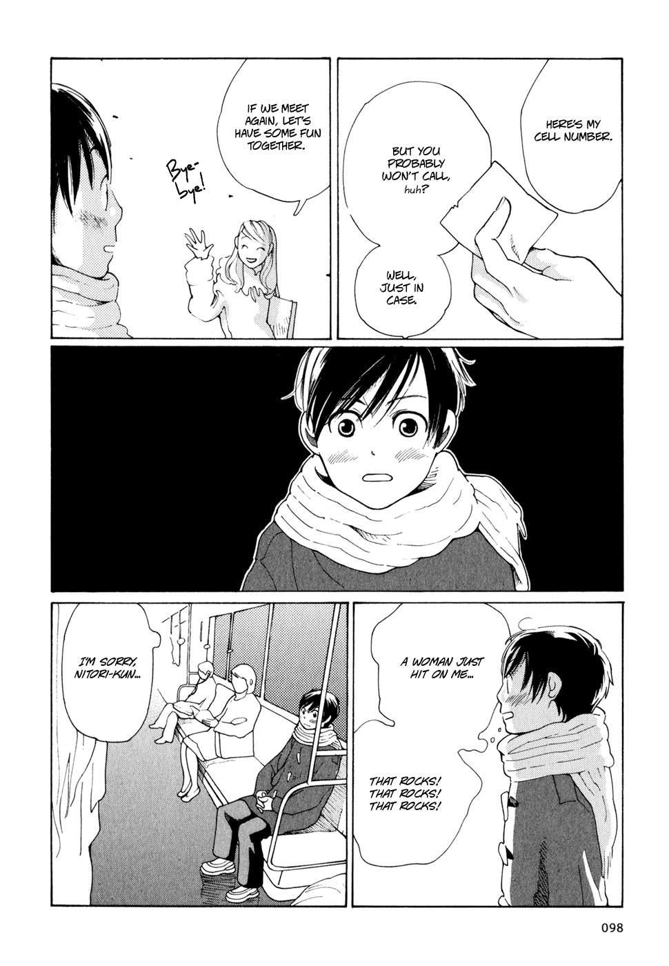
Now, I do love Takatsuki’s reactions. Those feel so real. I revelled in getting attention from adults too. It’s not… healthy at all. But it happens. Also again with the three horizontals.